Exploring The FFT - GF4 As an Educational Tool (Part 2)#
In FFT Part 1, we Created a damped sine wave and ran a Fast Fourier Transform on it. We looked at a few basic features of the FFT.
Points about the FFT#
There are a few points that should be discussed before we move on to today’s work. You may know about them already. First, the FFT actually produces a data set whose points are complex numbers. They are often interpreted as magnitude and phase. The phase represents the starting point of each of the frequency components, and the magnitude represents the amplitude or size of each of the components.
It is common to display only the magnitude, and that is what GF4 shows. This is most often what one is interested in. However, the phase information is essential for some calculations. GF4 does not keep the phase information because working with it would make the interface much more complex, yet provide little benefit for the kinds of things the program would mostly be used for. A magnitude-only FFT is also called a “real” FFT, which may be abbreviated as “RFFT”.
The second point is that the output of the basic formula for calculating an FFT is not unique: there are various normalizing factors that can be used, involving powers of √2π. GF4 uses the normalization factor provided by the NumPy RFFT routine.
Complementary Views#
A waveform, plotted against time, is referred to as a time domain signal or view. Its FFT is referred to as a frequency domain signal or view. Either view is a legitimate way to think about the signal. They each represent facts about the same physical (or mathematical) entity. Neither is “right” or “wrong”: they are complementary.
In the rest of this series, we will be emphasizing gaining basic knowledge about signal (i.e., waveforms) with only a very small amount of mathematics. The math is widely available should you desire to learn its details. You may already know quite a lot. Tools like GF4 can be used to understand a surprising amount about the waveform with a minimum of calculation, and this is what we will be emphasizing.
Basics#
Let us revisit the damped sine from Part 1, with a small change. Make sure that NumPts is set to 1000 again. Open the stack viewer window from the Help menu. Then generate a damped sine with 5 cycles across the axis, but this time use a “decay” time constant of 6. This will make sure that the waveform returns to near 0 before it reaches the right hand end. Then take the FFT.
Click the Push button twice to populate the stack with the FFT. Now click on the Loglog button, which will spread out the narrow peak and make it easier to see the shape of the FFT curve. It is much the same as the similar FFT we had in Part 1, but the peak is a little less distinct and spreads out more.
Switch back to linear axes with the Linear button.
Expanding The View#
We are going to look at the FFT more closely. The MatplotLib toolbar at the lower left has a control for this:

Click on the button with the crossed arrows. Now the curve will pan when the left mouse button is clicked, and it will zoom for the right mouse button. Expand the peak horizontally until a 0.005 frequency line shows, like this:
Your graph will not show the dots - each dot is a data point. Get them by using the Plot/Main Marker Style/Both menu item. Display them by clicking the Overplot X button - overplotting will not change the zoomed view, while plain plotting will.
Understanding The Frequencies#
The lowest frequency complete sine wave that the data span can have is one with exactly one cycle across the horizontal axis. For our span of 1000 points, this represents a frequency of one cycle per 1000 points, or 0.001. In the frequency domain - that is to say, the FFT - this means that the shortest possible step in the frequency is 0.001. Looking at our graph, we see that the dots do indeed occur at 0.001 intervals.
Our damped sine has five cycles across the span, so its frequency will be exactly 5 times the minimum. We can see that the peak does occur on frequency step number 5.
Non-exact Frequencies#
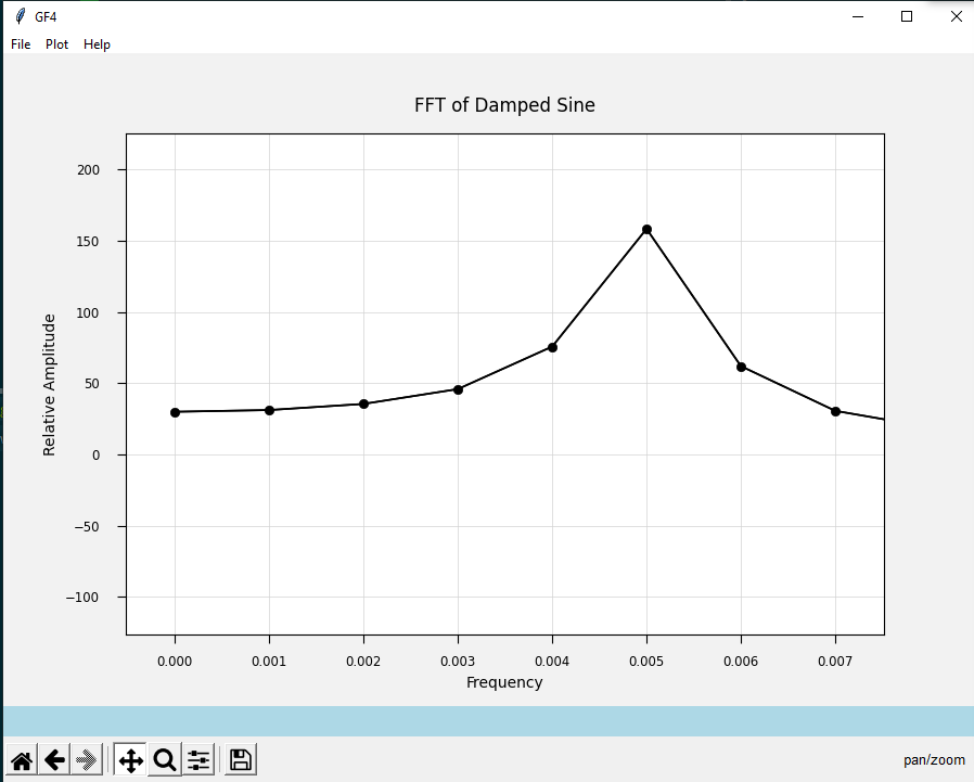
What will the FFT show if the dominant frequency is not an exact integer number of steps. The peak should fall between the FFT frequency points. We can try this out by generating a new damped sine with, say 6.5 cycles across the data span - the decay value has been returned to 6. Here is its FFT expanded to show the peak region:

The peak does indeed fall between the frequency values. If we want to determine the peak frequency from this FFT, we will have to interpolate, which may or may not be precise enough. Can we improve the precision?
Improving the precision implies having more points in the time domain. Imagine that this data set has been captured experimentally, and that we cannot rerun the experiment with a finer time step. What to do?
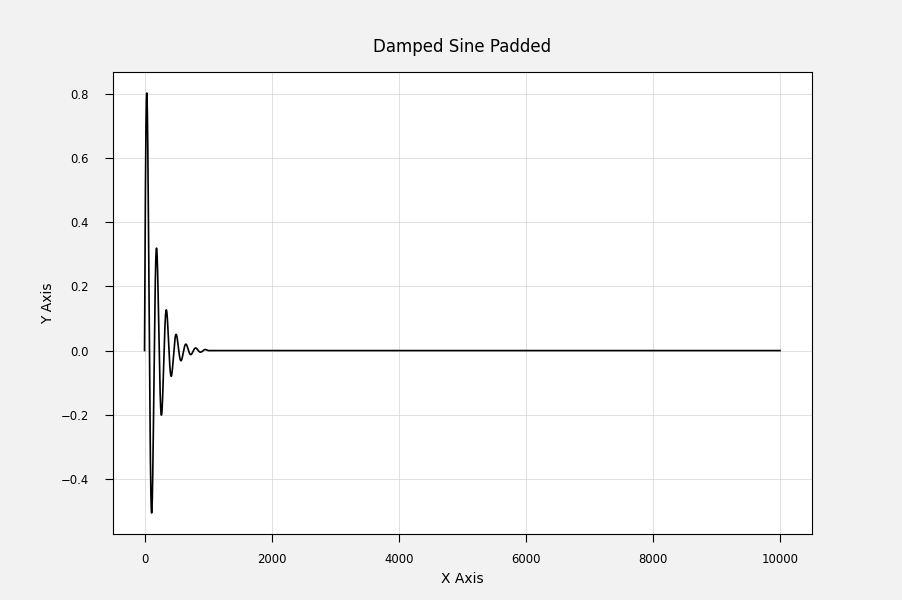
There is a simple way to have a record with more time steps: add them to the end of the record. We have no actual data for that region, so we have to add points with the value of zero. This process is called zero-padding, and GF4 can do it for us. If we have ten times as many points, the minimum frequency step will be 1/10 as large.
Zero-padding#
Generate our damped sine again, with the same parameters: 6.5 cycles, 6.0 damping. Take the FFT and either push the stack or copy it to the Y position using the Copy2Y button. This is so we can compare it with the FFT of the padded waveform in the next step.
One more time, generate the damped sine. Now click the Pad/Truncate button and make the new number of points to be 10000. This is ten times as many as we started with. Here is the result:
Next take the FFT. Expand it so the peak is clear and spread out. To compare this FFT with the unpadded one, first set the Y position to show both symbols and a line by using the Plot/Buffer Marker Style/Both menu item [*]. Next overplot the data in the Y position by clicking on the Overplot Y button.
Here is the result:
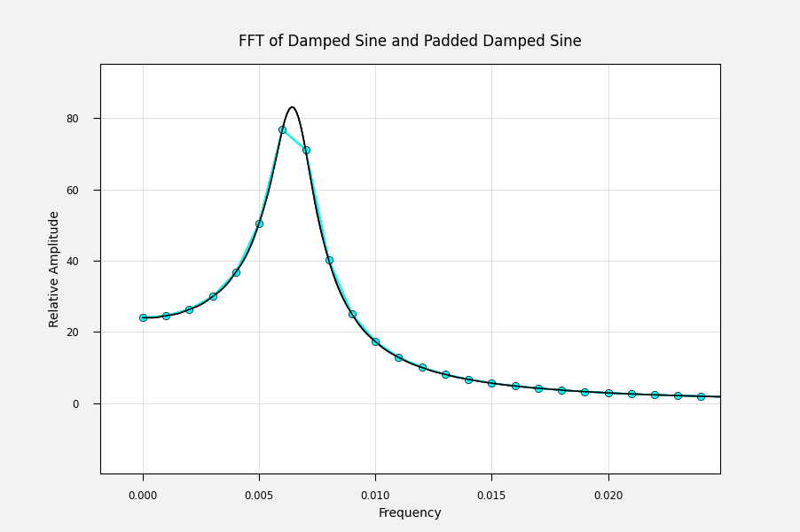
Notice that the padded FFT is “filled in” compared with the unpadded one. Otherwise the curves appear to be the same. This makes sense because we have not changed the actual data: we only added zeros, so we changed neither the frequency nor the total power in the signal.
Since there are now ten times as many frequency points in the peak, we can measure its position with ten times the precision.
Next Time#
We did not get to windowing after all. It will be discussed next time, along with some surprises for those new to FFTs. We will be calling on more of GF4’s capabilities to do this.